Chico, California Office: (888) 287-4461 Contact Us

    NORTH COAST TRIBAL TRANSPORTATION COMMITTEE

    Logo Redesign

    Why Change?

    The current logo has some balance issues that prevent it from being able to flex and fit different formats.

    NORTH COAST TRIBAL TRANSPORTATION COMMITTEE

    Goals

    1. Create a logo that can flex to fit a multitude of different applications and constraints.
    2. Retain the main elements of the current icon, but rework them into a cohesive, balanced representation.
    3. Assist in communicating a credible and trustworthy tone.

    Logo Redesign

    Building the Icon

    1Start with the diamond shape inspired from street signs and the central focus of Native American patterns.

    outside of the diamond

    2Rather than having the triangular shape pattern on the outside of the diamond, place it on the inside.

    outside of the diamond

    3Tweak the center triangle of the pattern to create a perspective road.

    redwood trees

    4Stylize the redwood trees using the same angles and similar visual weight as the rest of the line work.

    redwood trees

    Typography

    With the icon set, the question shifts to how we write the name. With an icon so sharp and clean, I would recommend a softer serif font to create contrast.

    The typeface P22 Mackinak is structured similarly to the original logo, so it retains some equity. It strikes a great balance between professional and personal. This helps present a polished image when working with governments, while retaining a friendly image when working with people they are advocates for.

    NCTTC in P22 Mackinak font

    Configurations

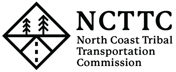
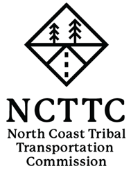
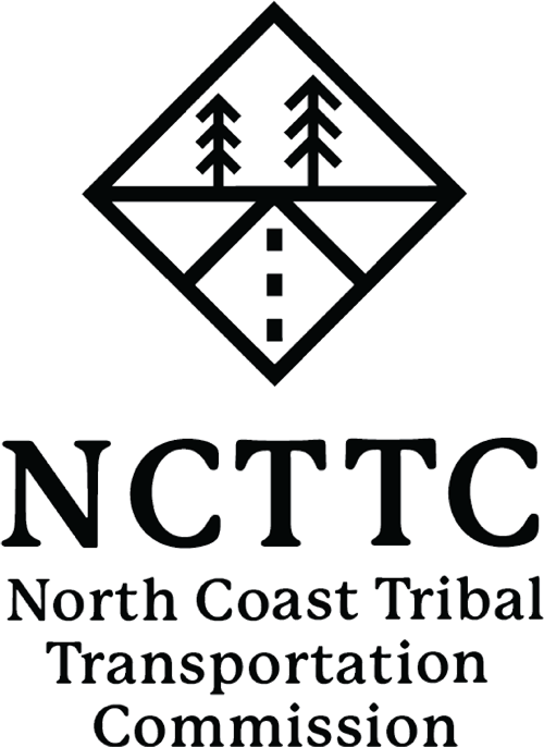
    The original logo uses enlarged capital letters at the start of each word. This draws attention to the “NCTTC” initials.

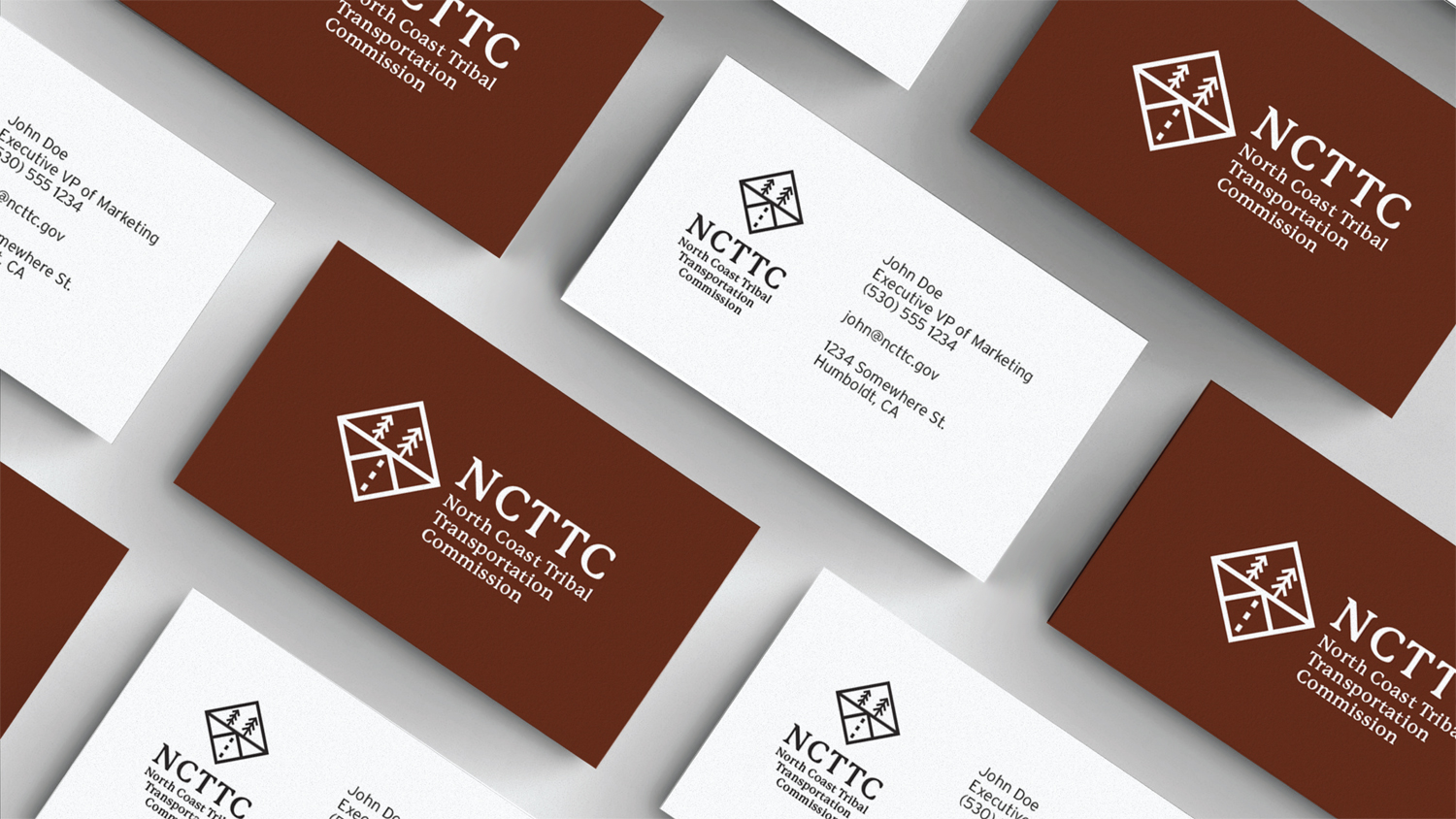
    When pairing the icon with the text, the first option I would recommend would be using a combination of the initials and the full name.

    This allows someone to quickly digest what they are looking at while still retaining all the information necessary.

    The first line of text is justified to the edge of the initials, giving a clean lean and softening the tapering rag created by the full name.

    North coast tribal transportation committee with logo

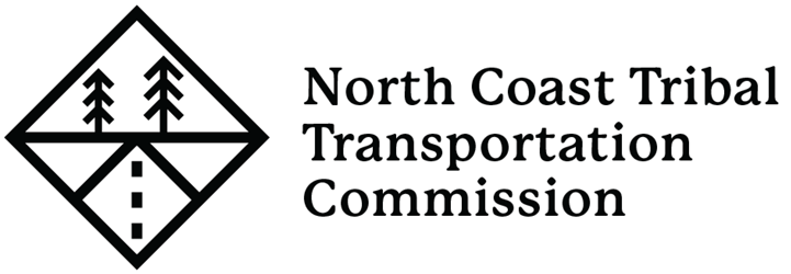
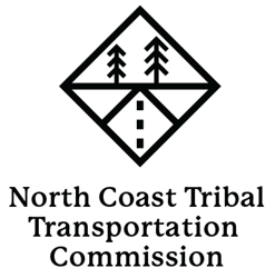
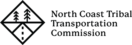
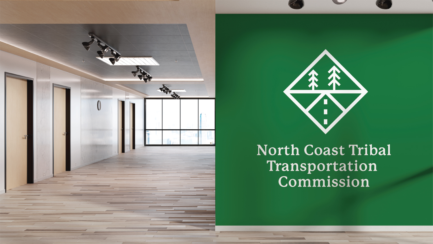
    This version excludes the initials and uses only the name. It requires a slightly wider footprint than the previous version.

    It is interesting that in this lockup, “North Coast Tribal” is on the top half of the icon with the trees, while “Transportation Commission” resides on the lower half with the road.

    North coast tribal transportation committee with logo

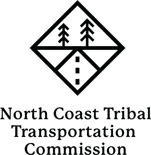
    When stacking the configuration, it would most likely be best to use a centered text justification to properly balance the logo.

    North coast tribal transportation committee with logo
    North coast tribal transportation committee with logo

    Initials – Horizontal

    • ncttc
    • ncttc
    • ncttc
    • ncttc
    • ncttc
    • ncttc

    Initials – Stacked

    • ncttc
      ncttc
    • ncttc
      ncttc
    • ncttc
      ncttc

    No Initials – Horizontal

    • ncttc
    • ncttc
    • ncttc
    • ncttc
    • ncttc
    • ncttc

    Initials – Stacked

    • ncttc
      ncttc
    • ncttc
      ncttc
    • ncttc
      ncttc

    Mock-ups

    logo designer for hirelogo designer for hirelogo designer for hirelogo designer for hirelogo design

    Before:

    NCTTC

    After:

    NCTTC