SiteHatchery is dedicated to staying ahead of the curve by understanding and implementing the latest advancements in web design and technology.
In this blog post, we explore the digital evolution of one of the world’s most iconic brands: Coca-Cola. By examining the changes in navigation, colors, layout, and underlying technologies, we reveal how Coca-Cola’s website has transformed over the years to keep up with the ever-evolving landscape of web design.
Join us as we take a closer look at how Coca-Cola’s website has evolved from static pages to dynamic, responsive, and immersive experiences, reflecting the broader trends in the web design industry.
Want help getting your own website started? Contact Us Here
1996: The Beginnings
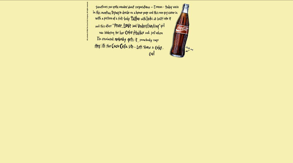
In 1996, Coca-Cola’s website was a simple static page, characterized by an image on a light yellow background with a “click me” button and quirky messaging.
The message was transparent about just being in the baby stages of figuring out how to advertise on the internet. This early website reflected the nascent stage of web design, where simplicity and experimentation were the norms.
Technologies used at the time included basic HTML, with minimal styling and no interactivity beyond basic hyperlinks.
Web Design Type: Static
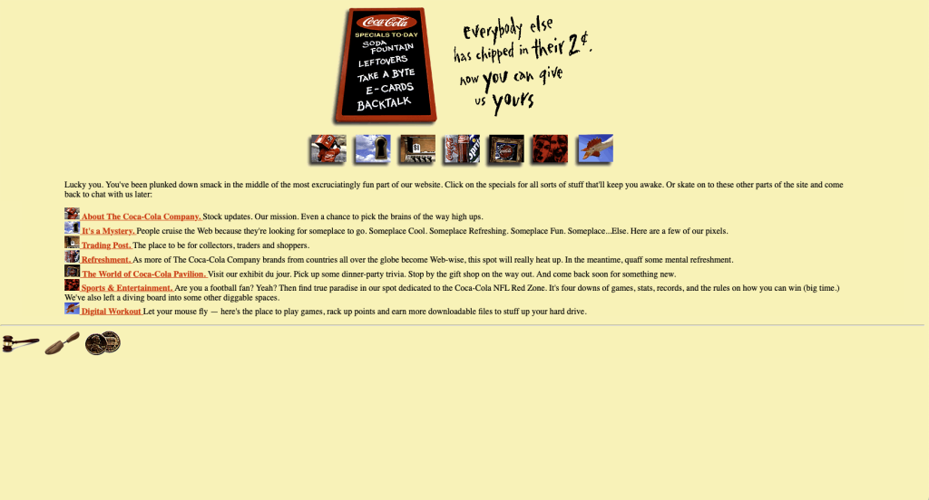
When you push the button “Click Me”:
2000: Embracing New Media

2004: Introducing Dynamic Content
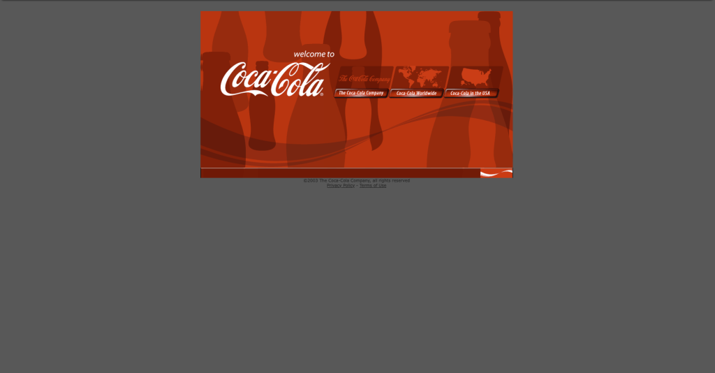
In 2004, Coca-Cola’s website saw a significant upgrade with the introduction of dynamic content. The site began using server-side technologies like PHP and databases to serve personalized content and interactive features.
Navigation became more complex with drop-down menus, and the overall design became more polished and visually appealing.
The layout transitioned to a boxed design, featuring a grey background with the website enclosed within a prominent red box. Amidst these alterations, Coca-Cola ensured that their logo remained prominently displayed, maintaining its iconic status and memorable presence.
Web Design Type: Dynamic
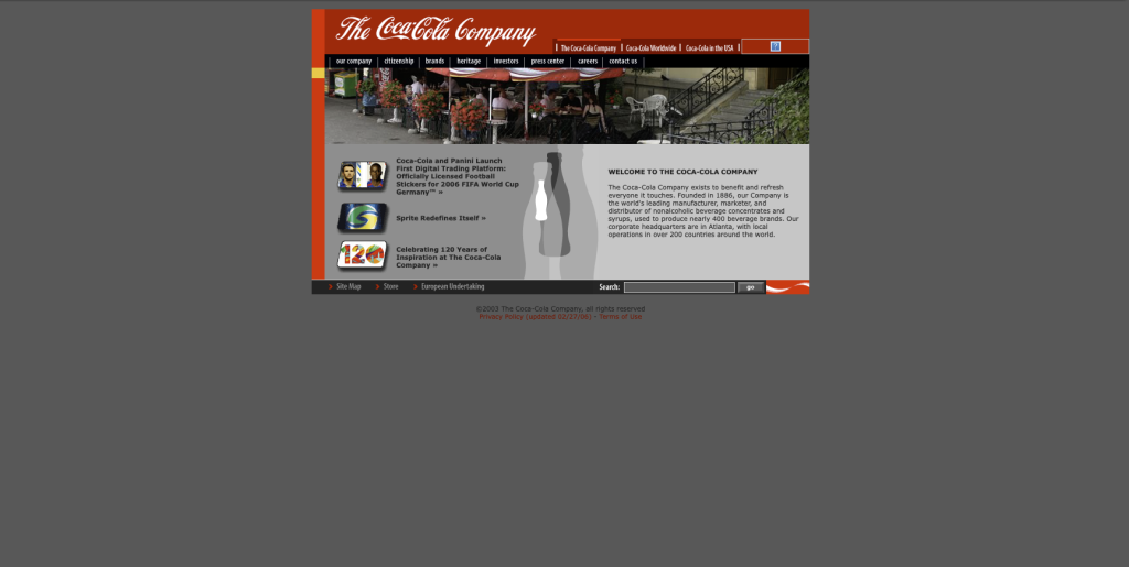
2006: An Upgrade
In 2006, Coca-Cola’s website design continued to evolve within the confines of a red box set against a grey background. This structured layout now incorporated tabs and an array of navigation links, indicating a concerted effort to enhance user accessibility and facilitate seamless browsing experiences.
Utilizing HTML and CSS programming languages, Coca-Cola embraced contemporary web design practices to ensure optimal functionality and visual appeal.
Web Design Type: Dynamic
2009: Breaking Boundaries
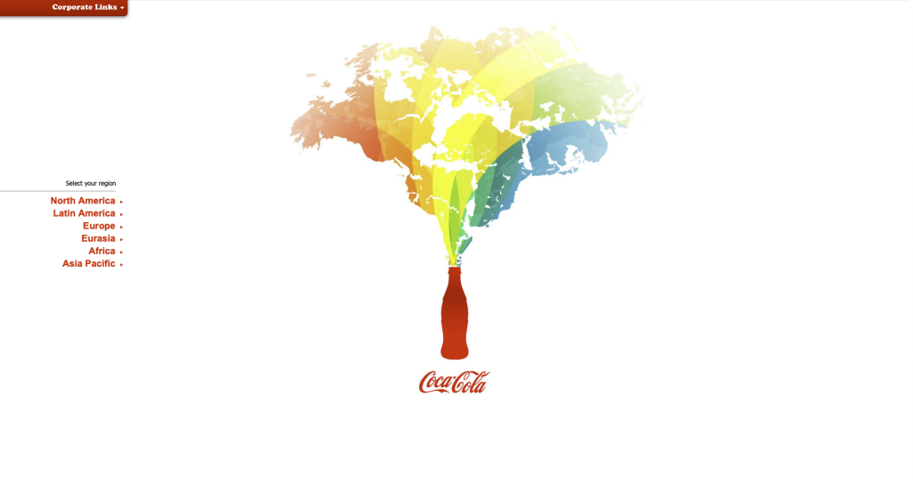
In 2009, Coca-Cola’s website underwent a significant transformation, breaking free from the confined structure of previous designs.
Embracing a full-screen layout with a predominantly white background, the website adopted a more expansive and visually engaging approach. A prominent main image served as the focal point, capturing the viewer’s attention upon arrival.
Navigation was streamlined along the left side, providing easy access to various sections of the site. This transition marked a shift towards a more dynamic and immersive web design experience, leveraging advancements in programming technologies to achieve enhanced interactivity and responsiveness.
Web Design Type: Dynamic
2012: Moving Forward
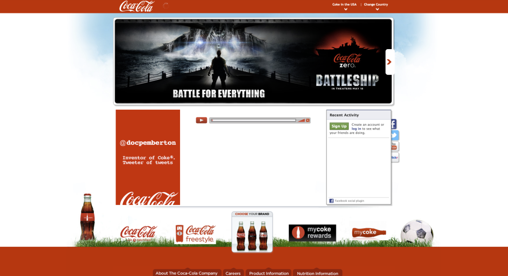
In 2012, Coca-Cola’s website design embraced dynamic features, including sliders and social icons. The structured layout, with a distinct header and footer, hinted at a responsive design approach, aiming to adapt seamlessly across various screen sizes and devices.
2016: Notable Transformation
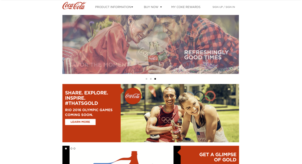
In 2016, Coca-Cola’s website underwent a notable transformation, adopting a dynamic design approach with the introduction of a simplified header. This design evolution aimed to enhance user engagement and navigation efficiency.
Moreover, the website’s responsive design framework ensured optimal performance across various devices and screen sizes, underscoring Coca-Cola’s commitment to accessibility and user-centric design principles.
2022: Refinement
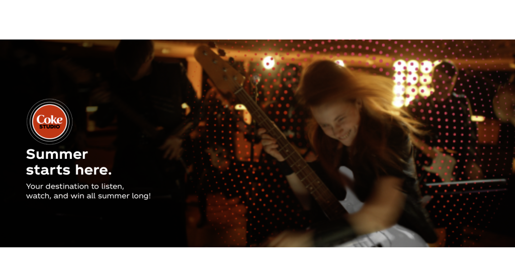
In 2022, Coca-Cola’s website underwent further refinement, leveraging a dynamic design approach to enhance user engagement and visual appeal.
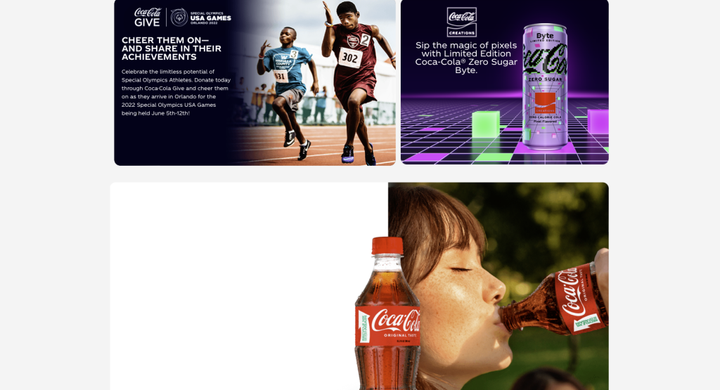
The site prominently featured large block images, showcasing new products and captivating visuals of people enjoying Coca-Cola beverages. While the logo maintained its iconic presence, it adopted a more modern and subtle aesthetic within the website’s overall design framework.
The incorporation of responsive design principles ensured seamless functionality across various devices, underscoring Coca-Cola’s commitment to accessibility and user-centricity.
Additionally, the website continued to highlight Coca-Cola’s involvement in global events, including its support for the Special Olympics, reaffirming the brand’s dedication to social responsibility and community engagement.
2024: So Far So good
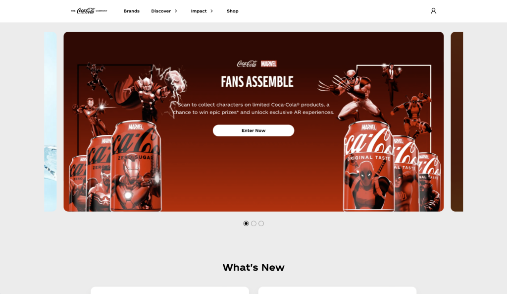
In 2024, Coca-Cola’s website embraced cutting-edge design and technology to deliver an immersive and interactive user experience. The site featured a dynamic design, characterized by innovative block layouts that showcased captivating visuals and engaging content.
Leveraging advancements in augmented reality (AR), Coca-Cola offered users the opportunity to explore interactive experiences, allowing them to interact with products and brand content in exciting new ways.
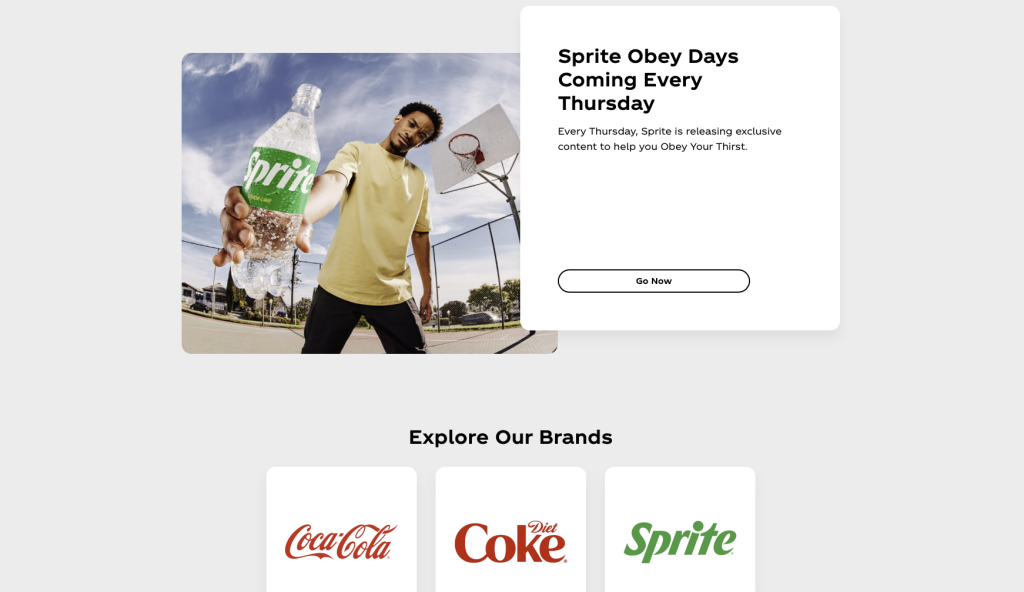
Additionally, the website highlighted Coca-Cola’s diverse portfolio by advertising its ownership and operation of Sprite, reinforcing the brand’s leadership in the beverage industry.
Through its dynamic design and forward-thinking approach, Coca-Cola’s website in 2024 exemplified the brand’s commitment to innovation and digital excellence.
Want help with your website? SiteHatchery can help get online! Contact Us Here
