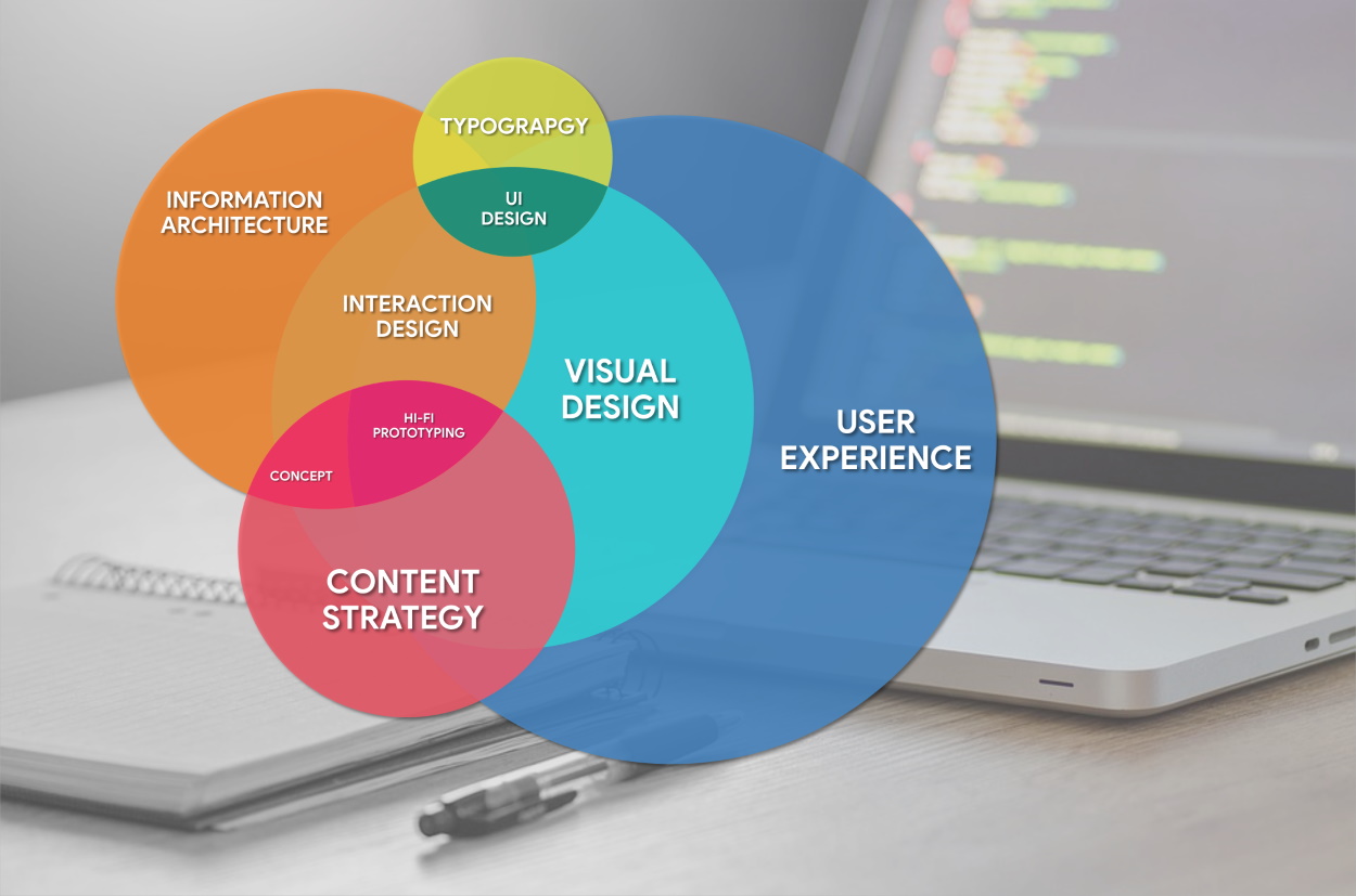
What does it mean to say you have a “usable” website? The term “usability” is actually an industry term that is based on an entire field of research and testing that, simply put, has to do with how easy it is for people to navigate and use your website. In this brief write up, we’ll cover, “What is usability, and why you should care?”
One of the first experts to explain, in laypersons’ terms, the concept of usability was Steve Krug, in his 2000 book “Don’t Make Me Think,” which was most recently revised in 2005. His theories and advice still hold true today.
Usability is based on the premise that people don’t “read” web pages, per se. We scan or skim them.
Essentially, Krug argues that everything on a web page should be obvious. Visitors should be able to immediately discern what is clickable. Web designers and developers should create pages with a “clear visual hierarchy,” with pages nested in a logical manner, and each page broken into clearly defined areas. You are doing your customers a courtesy and building goodwill if you make things easy, save them steps and anticipate their questions in advance, Krug says. Pages should also be printer-friendly, a goal that can be easily achieved by any designer experience in working with cascading style sheets (CSS).
Once you are fairly confident that your web site is usable, or even partway through the process, you should test it. This way, you’ll be able to make final decisions about site design with greater confidence.
There are consultants who charge big bucks to very specifically test for the “user experience” and determine how easily visitors are reaching the “call to action.” Some test for the overall usability of the site, while others focus solely on navigation – an element of the user experience that is especially important for ecommerce and information-based sites. They’ll test for things like time spent on a site or page and the “bounce rate.” In some cases, what’s best for your particular site, from landing pages to drop-down menus, depends on your audience (age, skill level, etc.) and how they prefer to use the web.
Or, if you are on a shoestring budget like many of my startup and nonprofit clients, you can still do formal testing. Krug suggests paying participants a small stipend and using cheap video cameras to record them as they experience your site. In Krug’s opinion, focus groups are not a good way to test for usability, because in a group setting participants will just react to one another’s views. It’s best to show a site to one user at a time. If your site isn’t complete, you can show them page sketches or a prototype. Tell your testers to try to “figure out what it is,” writes Krug, and try to use it to do a typical task. Krug’s 2009 followup book, “Rocket Surgery Made Easy,” explains how to do your own usability testing, and Krug even offers some free scripts on his site that you or your web developer can download to test usability.
There are also less-customized usability tests that can be done via a remote service or online tool, such as: Usabilla, Userfly, UserTesting, UserZoom and Loop11. To test specifically for navigation, consider the “top nine” recently reviewed by Forrester’s: Adobe Test & Target, Amadesa Customer Experience Suite, Autonomy Optimost, Google Website Optimizer (that one’s free), Maxymiser Content MVT, SiteSpect, Vertster Conversion Optimization Suite and Webtrends Optimize. Some companies track navigation and other browsing behavior via services such as ClickTale.com and Mouseflow.com.
It’s important to note that usability is not the same as accessibility, although an accessible website is inherently more usable. Accessibility is about making your website available to as many people as possible, regardless of what computer and web browser they use, disabilities they may have, and other factors that could affect how they experience (or don’t experience) your site. I’ll write more about accessibility in a future post.
Happy visitors are engaged visitors, and as long as you can keep them on your site and give them the experience and information that they want, they will reward you with their loyalty, traffic, clicks and dollars. Giving people what they expect to see gives you sales. Fail in the usability task and you lose goodwill, customers and money.
What bugs you about websites that aren’t as “usable” as they could be? Do you despise being forced to scroll down to find what you’re looking for? How about vague page descriptions such as “Resources” or “Other Stuff.” Please let me know your pet peeve by leaving a comment on this post.
Are you looking to update your website? Do you need an additional hand to keep up with the demands of your business? SiteHatchery.com offers a variety of services tailored for business owners. From web hosting, to custom analytic reports and intense security measure – SiteHatchery.com can help. Check out our Service Bundle, a convenient all-in-one service that is affordable and effective.
Posted by: Sitehatchery.com – a Chico web development company providing web design and development services nationwide.
