Website Design Project for
Wells Dental Inc.
Project Overview
Since 1921, Wells Dental has manufactured and provided quality dental laboratory equipment across the US. Notably known for their dental lathes, handpieces, finishing machines, hood and motors, Wells Dental pushes the envelope when it comes to revolutionary dental equipment.
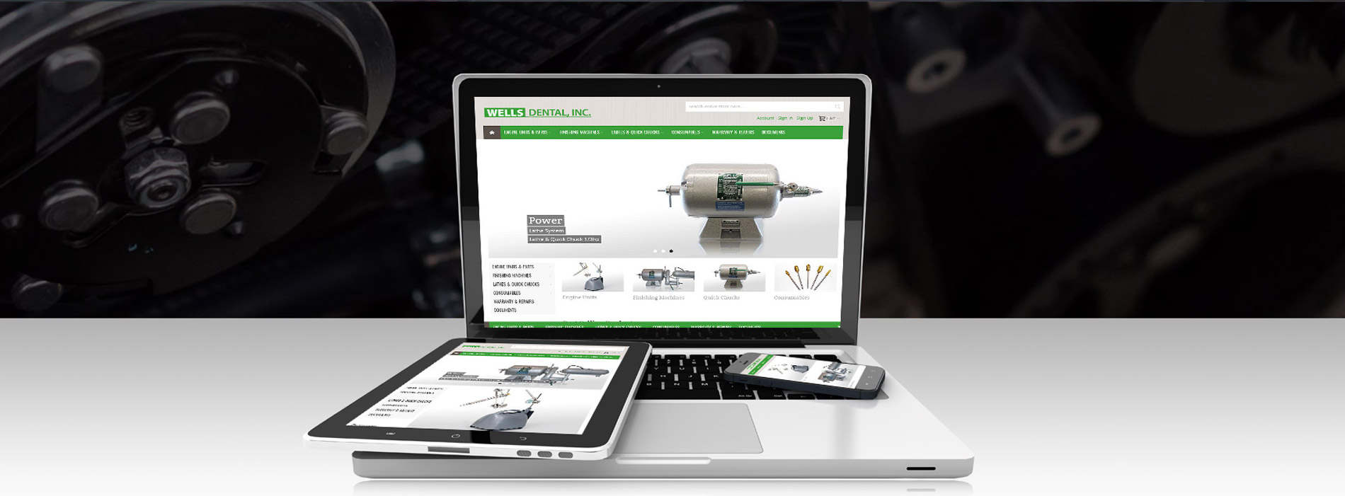
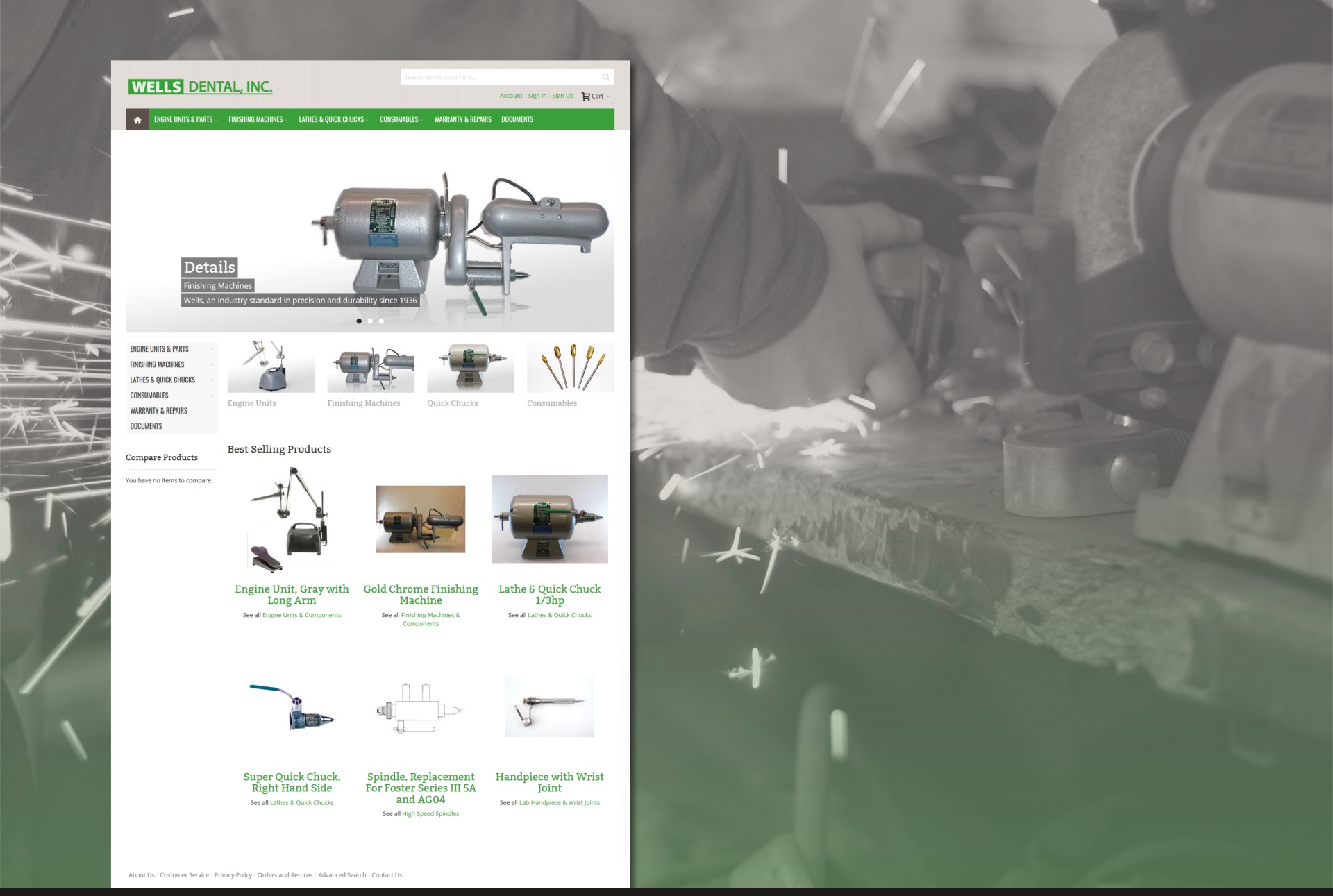
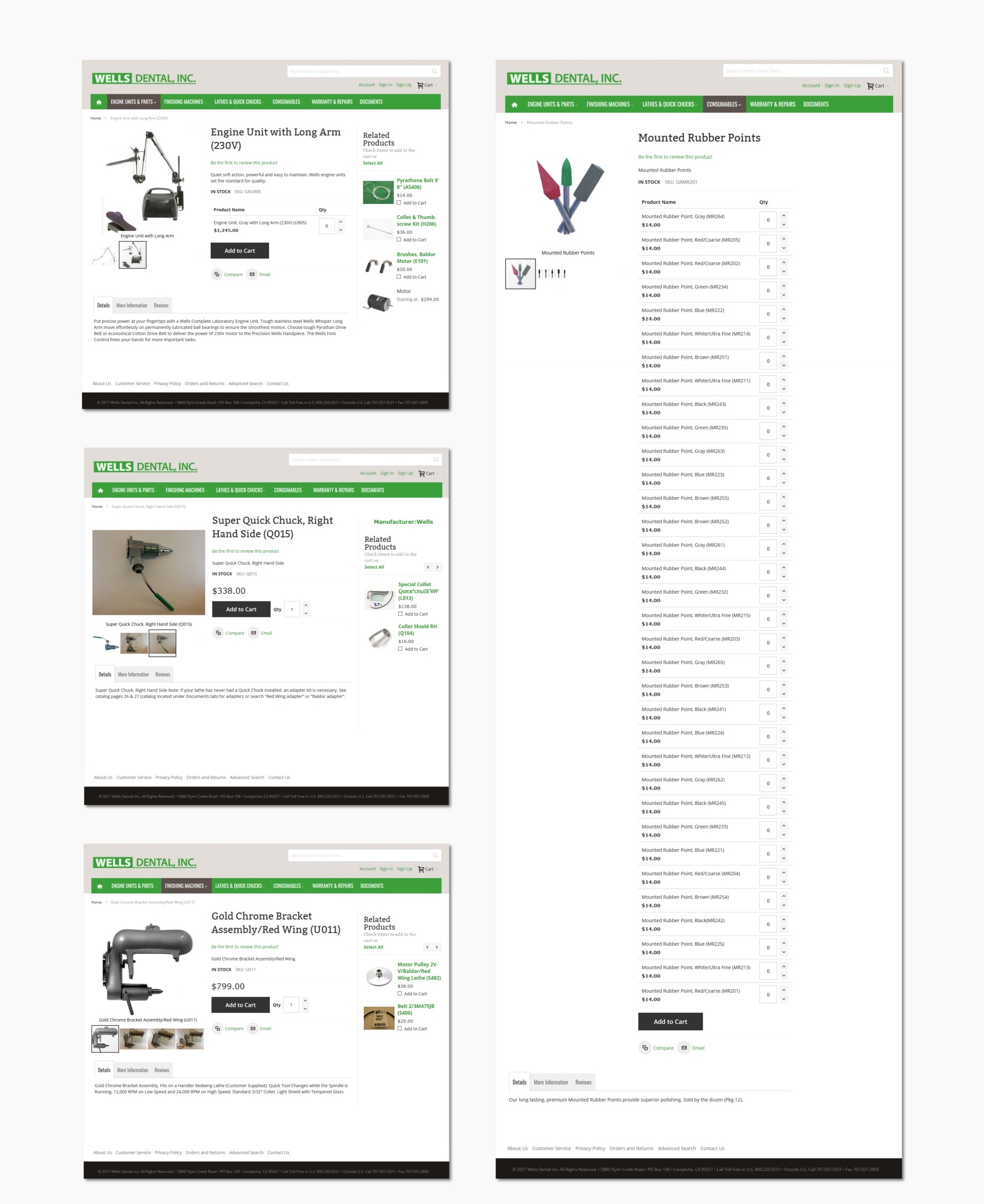
Wanting to showcase their products to the world, Wells Dental reached out to SiteHatchery.com to bring their goal to life. The website had to be informative while being responsive. The menus had to be simple, so visitors could find products and their information with ease. The website needed to include an eCommerce platform, allowing visitors to purchase dental equipment. The site is flexible, both as a shopping element and an information gateway which can be viewed on any type of device.
Technologies Used
- Web Design
- WordPress
- Ecommerce
Impact on Business
Being a manufacturer, showcasing products with informational features is critical component to growth. Users today are comfortable making decisions based on what they see and read, online. The more information available, the more likely a person will be apt to buy.
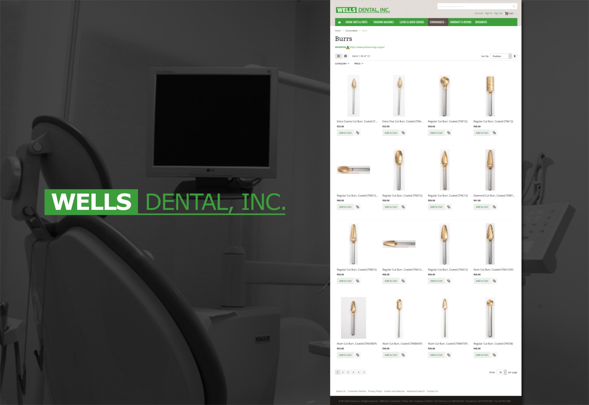
When working on the new website design with Wells Dental, we geared our focus on content. More than images and descriptions, we included reviews. This helped with buyer confidence. The next step, we added related products to each landing page. This eliminated guesswork of trying to search for relatable products. When it comes to products on a website, inventory can be hard to find. Having a related product feature simplified the search process for visitors.
With the new layout and access to product information, online sales have increased. Technological calls have decreased as guests can find their answers on the website. Business productivity has increased, as guests and customers can shop online.
Thinking Outside the Box
Websites don’t always need more – to be successful. In fact, websites that are bloated with content can deter visitors. Finding the right balance is a key strategy for any developer. When it comes to developing content, our creative team balances information with layout. Pages should be straight to the point, engaging and entice users to interact. Content is created to be easily digestible. Formatted to include snippets of features which guests are looking for. Offering features that interest your audience will increase views, sessions, and interactions within your website. This is one of the design techniques we implemented with our friends at Argyll Medical Group.
“Content strategy and layout are critical to a successful website.”
Project Management Techniques
In any project, it’s critical to have a game-plan. Like a house, our design team will create blue print specific to your business needs.
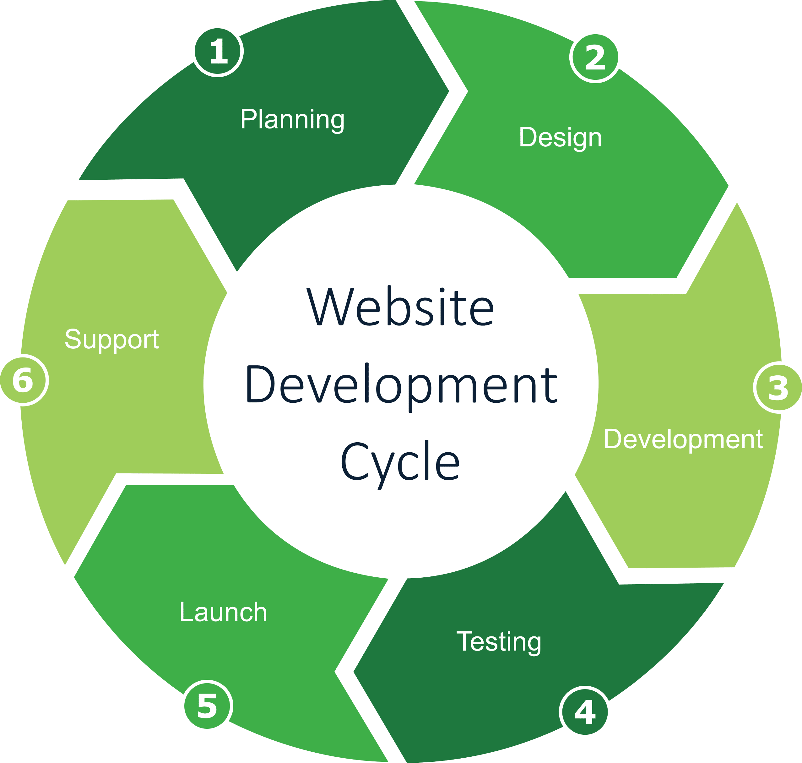
This is where we strive to separate ourselves from traditional website developers. We care about the final result and it’s important to us to have a clear picture of your dream house. To achieve this result, we have come up with a simple strategy. From start to finish, we will go through a series of questions. We check for form and function to ensure proper operation. We design and style so elements are appear as expected. With each step, we work with our partners and seek approval. There are no hidden surprises when you get the keys to your new place. Together, we stay connected through each step of the process.
